Security Company Brochure Design
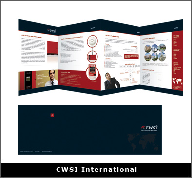
Security company brochure design will always include design elements that make the company look strong. Additionally, it is important to make it appear as if the company has been established for decades. This is as true for a security guard company as it is for a security equipment company. In this case, our client developed new technology in fire security equipment. Consequently, the company was brand new so we used stock photos of people.
In this image, you can see the front and back of the accordion fold brochure. However, we didn’t show the two pocket folder that we also designed. The pocket of the folder was vertical so that this brochure would slip inside. Conversely, the right pocket was horizontal and product sheets would go there.
Product Sell Sheets
The product sheets explained how each piece of equipment worked. Additionally, we used graphics and photos to help illustrate certain points. Also, there was a slit in the horizontal pocket where a trifold brochure would be placed. Consequently, these items together made this a very elaborate folder and brochure. Naturally, we had to make it look as if this was an international giant in fire security. In fact, this was important because all of their competitors were international giants in fire security.
When the sales reps hand this brochure to a potential client they are always impressed. Our professional design team created all of the company branding. For instance, we made the logo, we shot the product photos, and designed the inserts. Plus, we made a CMS website to match. As a result, this relatively new company is able to effectively compete with Fortune 500 industrial fire safety giants. A security company brochure design works like a silent salesperson. It keeps selling for you after the salesperson is no longer there.
Let our marketing team help your brand new business to fake it until you make it!
Please click if you are looking for a brochure designer.

