
Aviation Magazine Ad Design
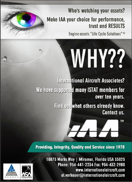
For this aviation magazine ad design we decided to use a big, colorful eye at the top of the ad. However, the eye doesn’t symbolize anything related to the aviation industry. We used it to attract attention because if we can’t make the reader stop and look then nothing else matters. After we spoke with the client extensively about their business and their competition we were able to design the ad. For instance, our client pointed out that all the other aviation parts companies all have very similar ads. For that reason, we wanted our ad to stand out from the rest. Consequently, in addition to the colorful eye, we put the “WHY??” in big, bold text. Now instead of being the best of the look-alike ads, we created a unique ad.
Web Design
Our web designer also created a new website for them using some of the same design elements and colors. We want it to be clear to anyone that sees the magazine ad and then goes to the website that its the same company. This is also important for branding purposes. All of their marketing materials need to look like they belong together. As a result, our client ends up with a cohesive marketing package.
Our writer has a Master’s Degree in Non-Fiction Writing and it is her job to create all of the text. When the text for the brochure was ready, we presented it to our client for approval. Consequently, the client approved and the text went to our designer. At that point he could see how much room could be used for design elements.
Lastly, when the text for the website was ready, our client approved it was added to the website.
Please click here if for more information about our advertising services.